- by New Deal democrat
Ugh! You would think after years of having their heads handed to them by economic data, the Doomers might go crawl away somewhere, but every now and then, they stick their heads up and, if they don't see their shadow, figure it's OK to come out and play economic analysis.
So today's lesson - alas, as usual - is about cherry-picking data. Both of DK's Pied Pipers are out today with claims that we've been in a second "housing bubble." One of them even showed up with -as we will see, fatally flawed - graphs.
For those people who might amble over here from that non-bastion of economic analysis, I've been bearish on the housing market for months. So much so that I even have a charitable bet with Bill McBride a/k/a Calculated Risk that housing starts and sales will be down by at least 100,000 YoY at some point this year (he's bullish, he thinks housing sales will average +20% YoY this year).
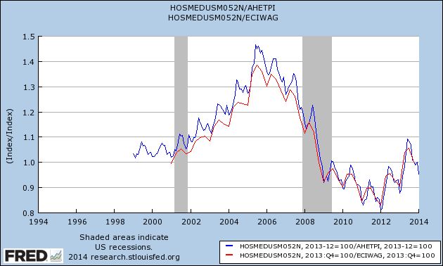
But being bearish is different than saying that the increase in house prices that began 2 years ago (that neither of the aforesaid twins saw coming) is a "bubble." It's possible that California might have some outlandish prices, but California is not the whole country. As I pointed out earlier today, the best way to measure the true cost of housing is to compare it with wages, and when you do that, you see that the median prices of existing homes are a little less than they were in 1999 and 2000 (blue), and just to be fair, equal to 2000 prices (the earliest comparison that can be made) when we use median wages (red), although for this I am stuck with a quarterly measure last updated through December:
Now let's do the same thing (both measures) new homes:
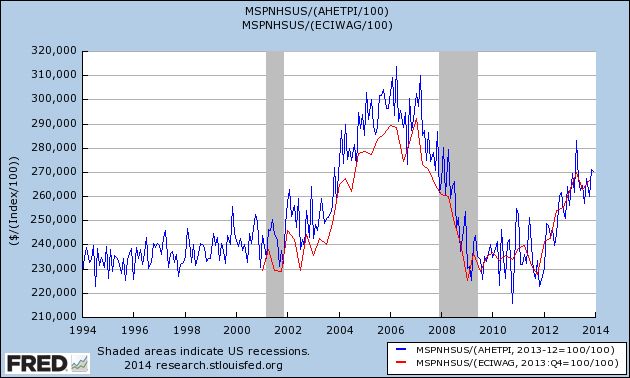
There simply is no housing bubble in the vast majority of the housing market. Even new home prices (10% of the market), adjusted both for average nonsupervisory wages and for median wages, are only about midway between their recent bottom and the bubble top.
But, but, but ... what about the graphs? Most of the graphs I actually have no problem with (e.g., mortgage applications are in the tank, and housing permits and starts have stalled, as I've already documented -- like I said, I'm bearish). Again, for those of you who might come over from yon, I've examined the relationship between interest rates and housing starts for almost the last 70 years, and the simple fact is, a 1% increase in interest rates almost always leads to a 100,000 decrease in permits and/or starts within a year afterward.
Most of the graphs have to do with housing sales. No problem. But there are two graphs upon which the claim that housing is in a bubble (i.e., prices) are based. One doesn't really prove anything, and the other is flat-out dishonest.
The one which really doesn't prove anything is the graph showing housing flips and profits. It's from Realty Trac, and here's the link to the article. And here's what Realty Trac says about their data set:
Homes flipped in 2013 accounted for 4.6 percent of all U.S. single family home sales during the year, up from 4.2 percent in 2012 and up from 2.6 percent in 2011. Flips accounted for 3.8 percent of all sales in the fourth quarter, down slightly from 3.9 percent of all sales in the third quarter and down from 7.1 percent of all sales in the fourth quarter of 2012 — the highest percentage of sales represented by flips in a single quarter since RealtyTrac began tracking flipping data in the first quarter of 2011.(my emphasis).
In other words, Realty Trac's data only began 3 years ago, close to the bottom of the housing market. What percentage of sales were flips in 2008? 2006? 2004? 2000? 1990? Realty Trac doesn't know, and doesn't purport to know. Is the percentage of flips in 2013 similar to what we saw in a healthy market? Realty Trac doesn't know, and doesn't presume to tell us. And even within their 3 year data set, the percentage of sales that were flips in 4Q 2013 were only a little more than 1/2 of what they were a year before (3.8% vs. 7.1%). Hardly the sign of a market that is getting frothy.
The flat out dishonest graph is this one:
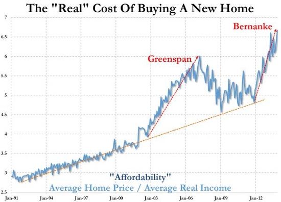
It's probably from Zero Hedge, although it actually isn't sourced at all. In fact it is a close relative of a Zero Hedge graph I debunked a year ago. Both suffer from the same dishonesty. They compare nominal house prices with inflation-adjusted income. If I compare the nominal price of Coca Cola from 1960 to the present, with inflation adjusted income, Coca Cola is going to look like its price has shot to the moon. Totally dishonest.
The honest comparison is nominal prices to nominal wages (what I've done above) or inflation-adjusted prices to inflation-adjusted wages. Do that, and if you find something that shows there is a bubble, now you've got my attention.
Unitl then, sorry, Doomers, there is no housing bubble in the vast majority of the housing market. But if it makes you feel any better, I think the housing slowdown is going to negatively impact the economy for at least most of this year.